The Client
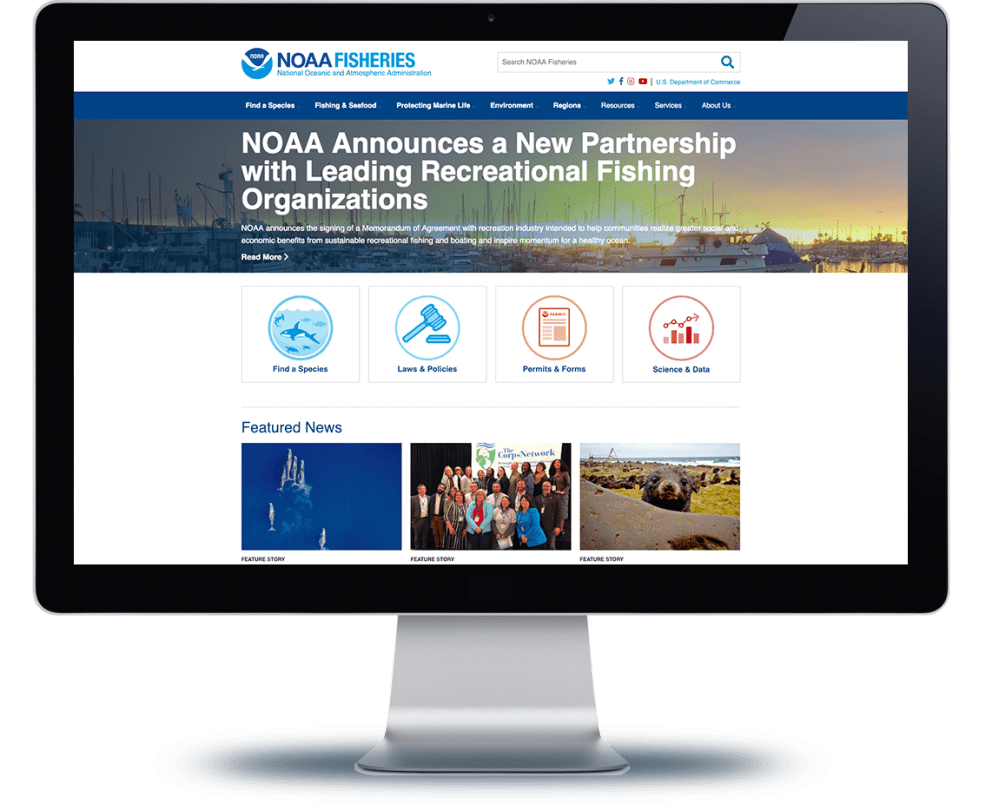
An office of the National Oceanic and Atmospheric Administration (NOAA), NOAA Fisheries serve as stewards of the nation's ocean resources. The organization provides a number of services that are vital to our personal, environmental and economic health and well-being, from promoting productive and sustainable fisheries to ensuring safe sources of seafood and recovering and conserving protected resources, with a scientific, ecosystem-based approach to management at its foundation.
The Situation
Serving diverse audiences — government, commercial and recreational anglers, educators and non-government scientists — NOAA Fisheries’ website needed to quickly offer each audience relevant content. NOAA’s content editors could confidently write and recommend resources on their topics, so pertinent content wasn’t an issue. But timeliness was another matter, as content editors struggled with an arduous, multi-step content creation and dissemination process that negatively impacted their ability to effectively communicate. And content editors weren’t the only ones who were frustrated; customer service and site growth metrics indicated that audiences weren’t keen on the experience either. It became clear that the team needed to streamline and enhance the web experience on both sides of the screen.
The Challenge
Gathering insights from site users, clear pain points emerged. One of the biggest culprits was the site’s poor navigation; filled with highly-technical terms, it left users lost and confused as to where to go next. Behind the scenes, content editors worked with Mobomo to identify additional challenges that were impacting the organization’s ability to perform optimally — what they found was that like many organizations, information, servers and other websites were siloed from the main website, limiting its potential and keeping valuable information locked away from hungry audiences.

The Solution
Mobomo and the NOAA Fisheries team started the redesign by conducting user testing among its four key target audiences, putting the site’s terminology and navigation through its paces over six test rounds. One key insight gained during testing was that much of the technical vocabulary NOAA Fisheries was using in its site navigation and architecture was unfamiliar to its audiences. With this valuable information, content creators and editors were able to improve the navigation, structure, and text on the site to better match how users interacted with it.
The Results
After moving to Acquia Cloud Platform and taking advantage of the COPE (create once, publish everywhere) method of content creation, NOAA Fisheries’ new Drupal site has seen an increase in both user engagement and site conversions. Removing the technical terminology from the site navigation boosted user engagement by 13 percent, and the final sitemap developed as a result of testing showed a whopping 600 percent improvement over the original navigation. For content editors, upgrading to Acquia Cloud Platform and its easy-to-use platform makes content entry and distribution a breeze, allowing them to focus their attention on improving other areas. As a result, the site has seen gains in both mobile traffic and search engine optimization.

