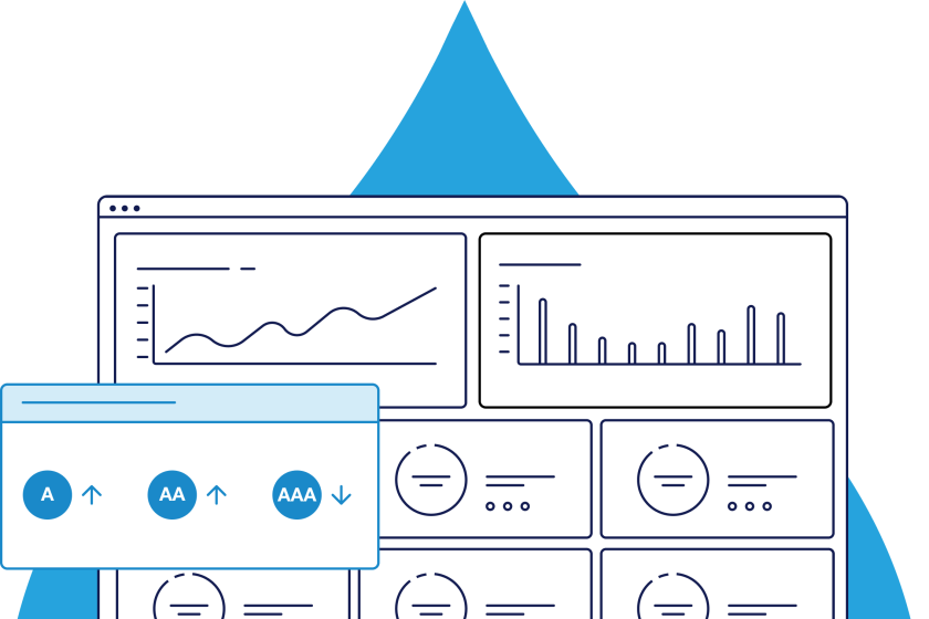
Color Contrast Checker
Test the contrast ratio of background and text colors for accessibility. Use it to visualize different color combinations for your website design that comply with Web Content Accessibility Guidelines (WCAG) and international accessibility legislation.
normal text | large text | components | |
|---|---|---|---|
| WCAG AA |  | | |
| WCAG AAA | | |

Foreground color picker
Background color picker
normal text | large text | components | |
|---|---|---|---|
| WCAG AA | | | |
| WCAG AAA | | |
Contrast ratio: 10.63 | ||
|---|---|---|
normal text | | |
large text | | |
components | |
Example
Lorem ipsum dolor sit amet, consectetur adipiscing elit, sed do eiusmod tempor incididunt ut labore et dolore magna aliqua. Ut enim ad minim veniam, quis nostrud.
Lorem ipsum dolor sit amet, consectetur adipiscing elit.
#7BEAF3 / #052942
Example
Lorem ipsum dolor sit amet, consectetur adipiscing elit, sed do eiusmod tempor incididunt ut labore et dolore magna aliqua. Ut enim ad minim veniam, quis nostrud.
Lorem ipsum dolor sit amet, consectetur adipiscing elit.
#052942 / #7BEAF3
Color Contrast Tool Guide
Contrast Ratio:
10.63 / 1
Either enter a background and foreground color in RGB, hexadecimal format, or pick a color using the color picker. Once a color has been selected the lightness level can be adjusted.
People with low vision often have difficulty reading text that does not contrast with its background. Providing a minimum luminance contrast ratio between the text and its background can make the text more readable for users who cannot see the full range of colors and also helps those rare users who see no color.
WCAG 2 Level AA requires the visual presentation of text and images of text to have a contrast ratio of at least 4.5:1, except for large text, which should have a minimum contrast ratio of 3:1.
WCAG 2 Level AAA requires a contrast ratio of at least 7:1 for normal text and 4.5:1 for large text (14 point and bold or larger or 18 point or larger).
Please note that incidental text such as images that are purely decorative or part of an inactive user interface component, and Logotypes, such as parts of a logo or brand name, have no minimum contrast requirement.
Color Contrast Tool Guide
Enter either a background and foreground color in RGB, hexadecimal format, or pick a color using the color selector. Once a color has been selected the lightness level can be adjusted.
How to Interpret Color Contrast Ratios
Minimum contrast ratio requirements
WCAG 2.2 Level AA Normal text: minimum contrast ratio of 4.5:1 | WCAG 2.2 Level AAA Normal text: minimum contrast ratio of 7:1 |
Large text is defined as 14 point (18.67 px) and bold or larger, or 18 point (24 px) or larger.
Need Additional Help?
Building website design elements with proper contrast is one of the many steps to take on your journey to an accessible website. Our platform provides the tools and data you need to ensure that your website is fully compliant and user-friendly for every visitor.
Why Use a Color Contrast Checker?
Contrast is one of the more common web accessibility issues, but also one of the easiest to fix. According to the U.S. Web Design System (USWDS), 4.5% of the U.S. population has some kind of color insensitivity that makes it difficult to distinguish or perceive differences in hues. People with color insensitivity and low vision often have difficulty reading text that does not contrast with its background. Providing a minimum luminance contrast ratio between the text and its background can make the text more readable for users who cannot see the full range of colors and helps those rare users who see no color. Use Acquia Optimize’s web color contrast checker to quickly check color combinations, and ensure that all your branded content assets and design elements are accessible to everyone. It can also be used to test color contrast with other legislation, e.g. as an ADA contrast checker.
| What is color accessibility? |
|---|
|
Color is such a vital element of web design as it is used to convey personality, attract attention, symbolize action, and indicate importance. As color carries a lot of significance in both being visually pleasing and conveying meaning, users must be able to perceive different colored content on a webpage. Color accessibility is important as it helps users with visual impairments like low vision or color blindness to properly distinguish content elements and read/view them effectively.
|
| What is a color contrast checker? |
|---|
|
A color contrast checker is a tool that measures the difference in perceived luminance between two colors to ensure that is perceivable to users with visual impairments or insensitivity.
|
| How is a color contrast ratio caluclated? |
|---|
|
The difference is measured on a ratio scale that starts at 1:1 (white on white) to 21:2 (black on white). According to the WCAG level AA, the minimum contrast ratio that colors can have for the visual presentation of text and images of text is 4.5:1.
|
| What is an acceptable WCAG color contrast ratio? |
|---|
|
WCAG 2.1 Level AA requires the visual presentation of text and images of text to have a contrast ratio of at least 4.5:1, except for large text, which should have a minimum contrast ratio of 3:1. WCAG 2.1 Level AAA requires a contrast ratio of at least 7:1 for normal text and 4.5:1 for large text (14 point and bold or larger, or 18 point or larger).
|
| Do images have to comply with WCAG color contrast requirements? |
|---|
|
Images must pass the WCAG contrast requirements. Images that contain text must ensure that the contrast between the image background and the text is sufficient, especially if the images are low quality and if the image needs to be enlarged in any way. Images of text must have a minimum contrast ratio of 4.5:1. For images that do not contain text, but still convey meaning, the image components must still have sufficient contrast to ensure that the overall image is perceivable. WCAG 2.1 level AA specifies that graphical objects and author-customized interface components such as icons, charts, and graphs, buttons, form controls, and focus indicators and outlines, have a contrast ratio of at least 3:1.
|